A digital money app that helps daily wage workers strategize finances
HELPING POOR CUSTOMERS STRATEGIZE WITH MONEY
Understanding the financial behavior of daily wage workers and people in the low-income group and influencing their transition to a formal digital platform. The aim was to design and test a money management tool for people with different financial behaviors.
WORK PROJECT: Moonraft Innovation Labs.
CLIENT : Consultative Group to Assist the Poor (CGAP) - WORLD BANK
YEAR: 2016 - 2017
DURATION : 17 Weeks
METHODS: Personas, User Stories, User Flows, Sketches, Wireframes, Rapid Prototyping, Visual Design, User Testing
TEAM : 7 people
MY ROLE : UX Design, Prototyping, User Testing.
TOOLS USED : Adobe Illustrator, Adobe Photoshop, Framer, Axure, Invision
Outcome of the Project
We designed and tested a money management tool for daily wage workers and people in the low-income group with different financial behaviors.
We interacted with the user group over the six design phases (design-clinics) and developed a deeper understanding of their thought process and behavior with managing money.
The insights of this project have been published in CGAP.
View the article.
Key insights that shaped the design concept:
The user group’s deep attachment towards people before money
A need for flexibility while sending and saving money
The user group’s behavior to click a lot of pictures and stream online videos.
Final Design
We designed all concepts keeping users’ pattern of interacting with mobile applications in mind from all the design phases and user testing sessions.
Familiar and straightforward text along with the use of large images were considered.
Landing Page
Transactions had People First approach
The landing page with minimum information was easy to comprehend by the participants.
The three most used features are shown upfront, and the rest of the features are tucked away in the Hamburger menu.
The "People First" approach was highly appreciated by the participants. Social relations were more significant for them and were prioritized over money.
All transaction flows like Send Money, Borrow and Lend money incorporated the people first approach.
"Len - Den" or "Borrowing- Lending" feature enabled the users to borrow or lend money to people in their contact circle. It was perceived as a social-security at a time of need.
Feature in the app that was highly appreciated
“Accha Karma” or “Good Deed”
The key to the final design was building familiarity by extending their associations to include people who were not in their immediate contact circle.
“Accha Karma” or “Good Deed” feature aimed at lending money to people in the second and third-tier contact circle while reducing the fear associated with it.
Emotion transcended to Images and Photos
Participants seemed to be delighted when they saw emotional text and images.
The use of images, especially in savings, motivated them to save for their dreams.
PART 1
PROJECT KICKOFF
The fundamental principles for this project were based on research carried out by Ignacio Mas, CGAP.
INITIAL RESEARCH
Initial research for the project was done by another firm, which became our team’s starting point for the design clinic 1.
TARGET GROUP
Initial research sessions with user groups took place in the city of Gurugram in Haryana, India. The target group was a daily working class people with low income.
Both men and women were part of the usability testing. The age range was bucketed into two groups : less than 35 years and 35 - 40 years. The user group was further bucketed into two groups based on salary, one being less than INR 25,000 and the other greater than or equal to INR 25,000.
Insights from Initial Research
Initial research led to six opportunity areas that influenced the tools and features of the mobile wallet app.
Employer is their banker
For migrants, a sense of organic community is absent in cities and employer is the natural go-to-person for borrowing.
Daily and weekly wage earners spend more
Daily or weekly wage earners have a higher frequency of income and spend a greater proportion of their income on recreational activities, against those who see cash flow once a month.
Borrowing for family obligations
Even if the whole demand cannot be met, some amount is given to the relatives. The obligation is strong enough for one to borrow in their name to help out relatives in times of need.
Irregular earnings lead to untimely payments of dues
Those earning an irregular, daily wage are less likely to keep track of regular predictably expenses and pay them on time-leading to a high community friction.
One time expenditure take priority over planned expenditures
When income increases are small and variable, it is cognitively easier for individuals to allocate surplus money to one-time expenditures as compared to planned expenditures or savings.
Earnings and Savings are limited
There is a maximum amount that one can save post which one has to go to some of the well off people in and around where they live to borrow money.
PART 2
THE JOURNEY - 6 DESIGN CLINICS (PHASES)
Moonraft (the firm where I worked ) collaborated as User Experience partner with CGAP and other firms on the project.The project was planned for 17 weeks and divided into 6 sessions named Design Clinics.
During those 17 weeks, a lot of insights came out of the user testing which very much shaped the final App design.
We tested our designs at the end of each clinic with predefined goals. User feedback and other insights from testing guided our design activity for the next clinic.
The outline of the Design Clinics is presented below.
INITIAL IDEATION AND CONCEPT PHASE
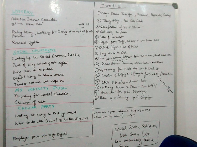
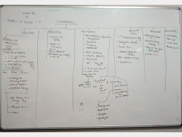
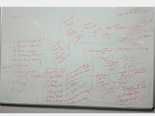
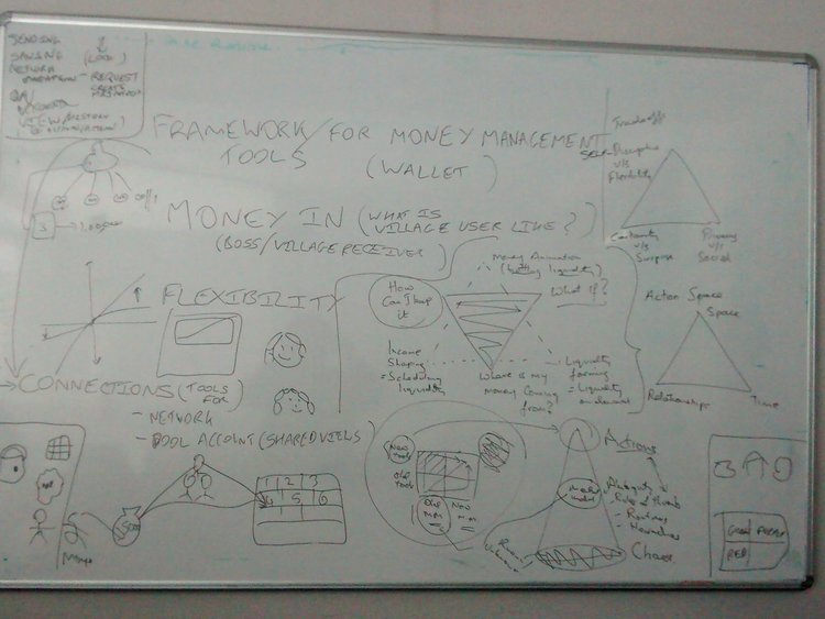
Initial Ideation and Concepts were fleshed out in our studio in Bangalore.
In order to empathize with the different types of users, we went back to the user interviews from the initial research. These served as a starting point to reflect on the needs and challenges of the users
By brainstorming and prioritizing ideas in terms of emotional connection (“How can we make a transaction more emotional than mechanical ?”) and multi-utilitarian (“Taking the app beyond just a money management app”), we quickly came up with the road-map.


HOW DESIGN INSIGHTS IN EACH DESIGN CLINIC HELPED SHAPE THE NEXT DESIGN
Insights from each design clinic were implemented in the next design clinic. Things that worked and didn’t work were noted down. After detailed discussions weighing the positives and negatives of what we learned in that clinic, design decisions were made for the next clinic. One example of how that worked is shown below.
Insight from Design Clinic 2 : Elaborate labeling for buttons worked better.
Elaborate labeling was more contextual and easy to understand, e.g., Instead of ‘Naam’ (Name) we used ‘Bachat ka Naam’ (Name of the Saving) Instead of ‘Enter Mobile Number’ use ‘Enter Your Mobile Number
Insight from Design Clinic 3: Features which were not displayed upfront were not explored
USER TESTING
User testing was done at the end of each Design Clinic. Paper prototypes, as well as digital prototypes ( using Axure, Framer, Invision softwares), were tested out with user groups. These exercises gave us insights on users' perception of our design and highlighted areas that needed refinement.
Discussing Ideas at the Studio
Design Clinic 3 : Testing Digital Prototype with users
Design Clinic 4 : User Testing the Digital Prototype
Design Clinic 5 : Card Picking: What the user felt about the app
PART 3
FINAL DESIGN
Learnings from the Design Clinic
The interactions with the participants in each design clinic gave us very different perspectives into their lifestyles and handling of money. We discovered a new set of terminologies used by them associated with money. For example, "Gullak" is a small pot used to store emergency cash in the kitchen.
These insights shaped our final design. Some of them are mentioned below.
HOW THEY THINK
Borrowing and lending money transformed into social security
Desired to be perceived as responsible and respected individuals.
One dream was the focus with others in the background
CONTENT AND LANGUAGE
Universally used banking process gave confidence
Contextual Translation worked better than direct translations
Resonated highly with emotional content
DESIGN
Elaborate labeling for buttons worked
Features that seemed new were rejected
Features that helped to maintain relationships were appreciated
Flexibility was appreciated for each feature
Dashboard with minimum information was easy to comprehend
Closure gave confidence of using the app by avoiding mistakes
The Tenets of the Design
The leanings from the design clinic led to the development of the final design.
Key insights such as deep attachment towards people before money, need for flexibility while sending and saving money, and their behavior to click a lot of pictures and stream online videos, helped us shape the design tenets for the mobile application.
IMAGES
Memories play an important role in the existence of man and images are powerful in capturing them
PEOPLE FIRST
A people first approach would ensure that the app is social in nature
TOOLS
Tools would hand over the power of decision making to the user. The user gets to choose from the set of the tools to decide the features of transaction
CONTROL
Financial data in the app would help the user have a control over uncertainty in life. It would help the user to find solutions to the situation
EXPERIENCE FLOW
To maintain an easy to understand interaction pattern, we defined a universal experience flow for the app
Shown below are few of the interaction flows in the final design based on the experience flow
Transaction Flow - Send Money
Universally used banking process gave confidence
Borrowing and lending money transformed into social security
Savings Flow - Compartmentalizing Money
Create their own image-based savings sub wallets. Add trusted contacts and give them specific rights to their sub wallet
A unique feature - “Good Deed”
One of the critical insight “Borrowing - Lending money transcended to social security” was developed as a feature in the app. The community with a very low margin of savings, tend to seek help from relatives and friends when the financial burden is high. There is a certain shame and stigma associated with asking for help and trust issues while lending money.
The feature “Good -Deed” aimed at lending money to people in third-tier contact circle in the community while reducing the stigma associated with it. The feature was designed keeping in mind the user-groups association with the “karma” or “good deed” which would propel them to help others more willingly. The feature also encouraged people to ask for financial help . This feature was highly appreciated while testing and appealed to the user-group the most.
Where is the Prototype?
Because it is a client project, I cannot share the prototype.
However, the insights of this project have been published in CGAP. View the article.
PART 4
WHAT I LEARNED
In one of my previous projects, we followed a specific flow for designing: discover > define > plan > launch. While that too led to a great outcome, this project taught me that the standard UX process is not quite one-size-fits-all. In this project, I understood the users and their mental model regarding their finance better during user-testing of a concept than I did from the initial research insights.
During user-testing, some of the findings in terms of their way of managing finances contradicted the initial research findings. In the initial interviews, many of the users felt hesitant to mention their lack of financial planning or lack of knowledge in terms of using mobile applications. This was discovered in the early rounds of user testing, when our initial designs failed miserably.
The project itself was very challenging and insightful. I particularly learned the importance of empathy in this project because without putting ourselves in their shoes, we would not have come up with a successful design. One-on-one interaction and user-testing mattered a lot as there were many subtle yet powerful insights that we got which shaped the final design of the mobile application.


